We are halfway through 2014 and the trends are nailed down. Website design is all about consumer outreach and functionality.
But how is that achieved?
The key is simplicity. Seven website design trends are kicking butt.
Staying Trendy in 2014
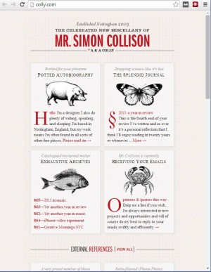
Responsive Design
Smartphones and tablets are flying off the shelves. It is imperative for websites to have seamless functionality on mobile devices. Responsive web design makes page elements, such as pixels, relative rather than absolute for optimal user experience on any device, regardless of the screen size. The images, content and navigation transform for each device.The rate of mobile devices being used to reach the internet is rising. A seamless and enjoyable website keeps people scrolling.
Flat design
Flat design removes stylistic choices that make websites appear three-dimensional. The minimalist design uses simple elements, flat colors and typography.
The outcome?
A streamlined website that quickly conveys information without the clutter. Flat design has become a hit for 2014! Flat design websites load faster, resize easier and look sharp on hi-definition screens. Flat design achieves more by using less.
Parallax
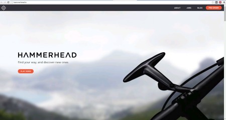
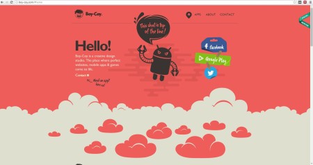
Parallax scrolling are layers that separate a graphic from text. The graphic is the bottom layer and scrolls slower than the text. Parallax is a displacement with two different vantage points. Parallax adds depth with creative imagery and powerful typography. Web design pros are using parallax on homepages to create mind-blowing websites that spike curiosity for the company’s products and services.
Infographics
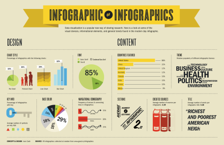
Infographics represent a lot of information in a small space. The technique combines visuals with statistics, figures and facts, using bold typography, colors schemes and shapes. Infographics are eye candy for information. Infographics are one of the most effective methods of communicating with a large audience. They are one of the most shared content on Google+, Twitter, Facebook and other social media streams. Infographics helps us absorb information like sponges!
Typography gets serious
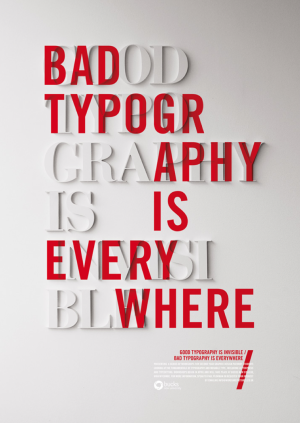
2014 typography uses alternative fonts to illustrate content with personality. The appealing composition involves size, line length, spacing between letters and typefaces. It is easier to read certain fonts, but many designers think that we are bound to two or three styles. Now designers are stepping away from serif and Times New Roman. New “fonts with personality” are professional, yet powerfully manifest the message.
Social icons
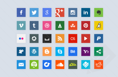
Marketers are now incorporating social icons to increase traffic. The communication tool enables customers to interact with their favorite brands. Facebook, Google+, Twitter and LinkedIn are the most common social resources. Social icons are all the rage in 2014! Your customers can “like,” “plus,” “tweet” or “share” your business right from your website.
Fixed navigation
Fancy navigation systems have been adopted over the years. Fixed navigation preserves the positioning of a websites navigation when you scroll. Browsing is easier because users are always able to relocate pages without scrolling back to the top. Websites gain speed. In 2014, fixed navigation has created more functional websites.

The consensus among website design is pretty cut-and-dried. High converting websites are familiar and popular, with a dabble of creativity. Fixed navigation, mobile and social connections, and readability increases traffic, yet in 2014 designers have the flexibility to experiment with composition. In six months, we will emerge into 2015. Website design fluctuates consistently. Until the New Year, we will keep our eyes open for the upcoming trends.